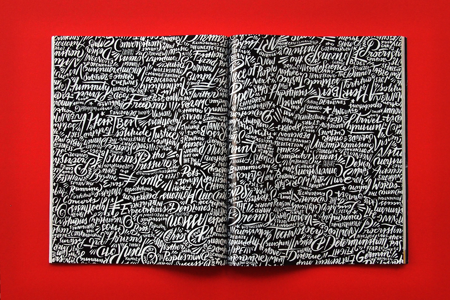
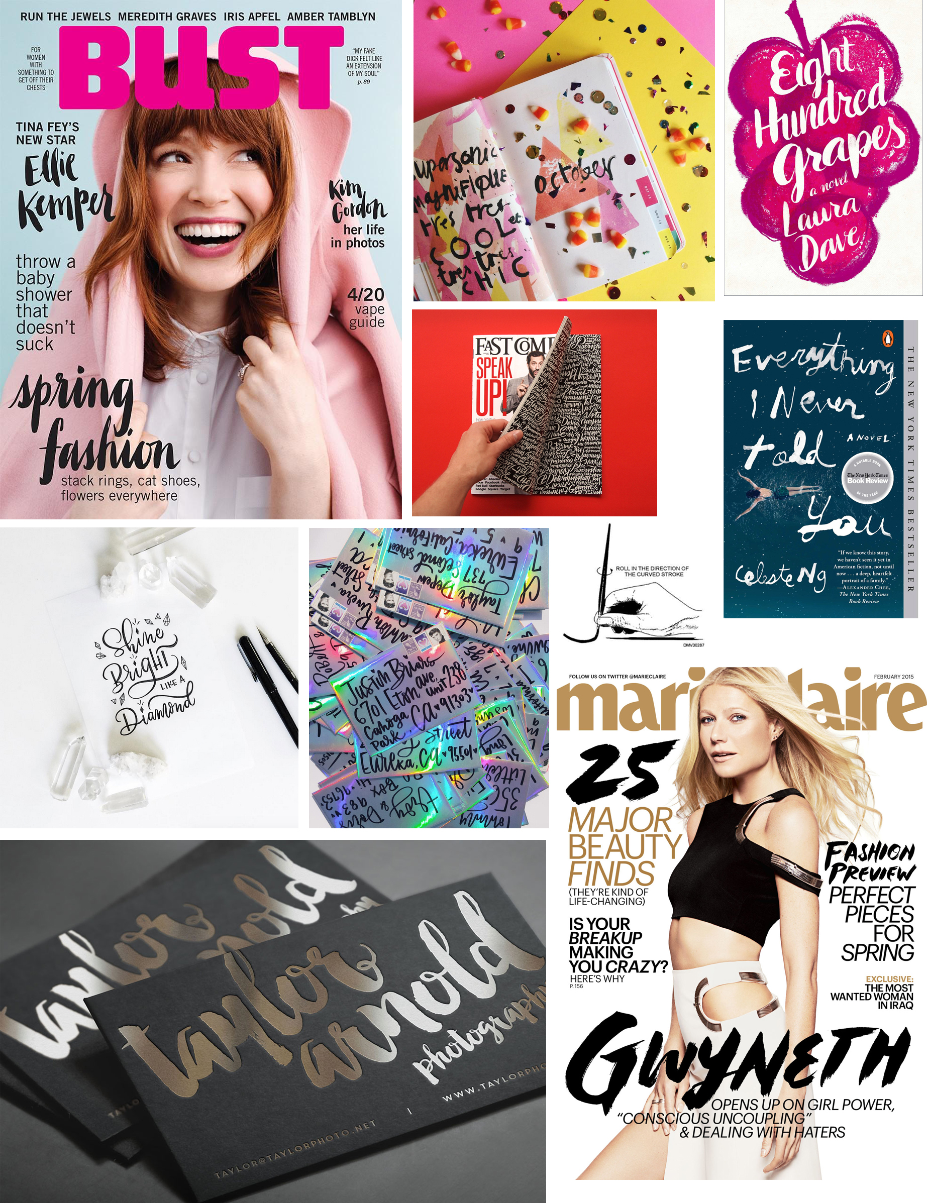
[tatsu_section padding= "90px 0% 90px 0%"][tatsu_row layout= "1/1"][tatsu_column layout= "1/1"][tatsu_text max_width= "" wrap_alignment= "center" animation_type= "none"]Trends are cyclical, and everyone knows it. Much of the 80s and 90s saw a rebellion against the cleaner mid-century modern design aesthetic, influencing a more punk/grunge look. The early 2000s and 10s brought about a resurgence in precise and controlled digital type–especially sans serifs. So many sans serifs. Now, of course, the trends have cycled around once more and people are finding more appreciation in the forms created by hand-lettering. Calligraphy became incredibly popular last year. Modern calligraphy, with its hairline thin lines coupled with very thick downstrokes and large spaces between letters, has become the go-to style for everything from wedding invitations to personal notes.
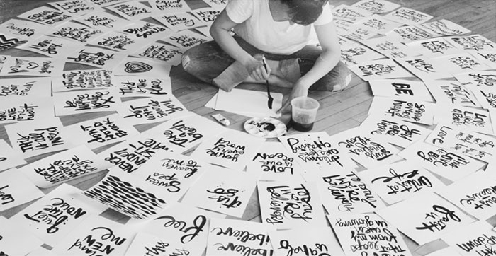
But 2015 has since seen the rise of brush lettering, and it's dominating the spotlight right now.
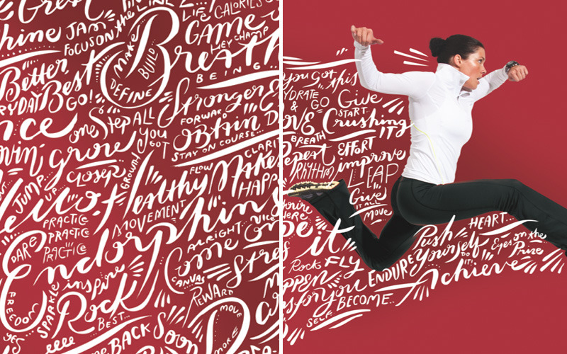
Brush lettering features a heavier hand, and is less precise than standard lettering. Its "messiness" gives it character, and lends itself to a more personal and custom look. When combined with a dry brush or watercolor effect, the type gains even more customization options and the same words can look different in a number of ways.
How do you feel about this trend and its speedy ascension to popularity?
 [/tatsu_text][/tatsu_column][/tatsu_row][/tatsu_section]

No comments.