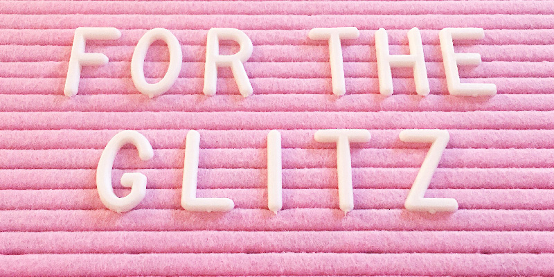
[tatsu_section padding= "90px 0% 90px 0%"][tatsu_row layout= "1/1"][tatsu_column layout= "1/1"][tatsu_text max_width= "" wrap_alignment= "center" animation_type= "none"]Over the past couple months, I’ve been working on separating this blog from my personal design portfolio, and I’m happy to say that I’m moving on over to fortheglitz.com as of January 16! So when you come searching for my new blog posts, remember to check over there and not here. I'm so excited to launch in the next couple of weeks; I hope you guys love the new site as much as I do.
As far as links go, all the previous links should forward you to the corresponding post on the new site, and the blog button in the upper right on this site will take you directly to For the Glitz. I'll be changing my social media handles as well, so make sure to tag @fortheglitz in anything you want me to see!

Now that the big announcement is out of the way, I thought I'd show you a bit of my inspiration and thought process behind the rebrand.
As you probably know, I’m a big fan of everything pink and sparkly, and while much of my life reflects that, I was having trouble showing it in my blog posts. X-Height-Ment was originally created to be the name I operated under as a freelance designer, but as it began to change into this blog and the content shifted, I found that it wasn’t creating the image I wanted. I started from scratch and built For the Glitz. I started with a mood board, pulling images, colors, textures, and patterns that I connected with and that I knew would fit with the image I wanted to create. After culling this massive collection down to a reasonable number, I was able to see patterns and trends in the images I had selected, and discovered exactly what I wanted For the Glitz to look like and laid out a clearer vision of what the content should look like.
Take a peek below at some of my early mood board collections. The full brand reveal will be up on For the Glitz on January 16!
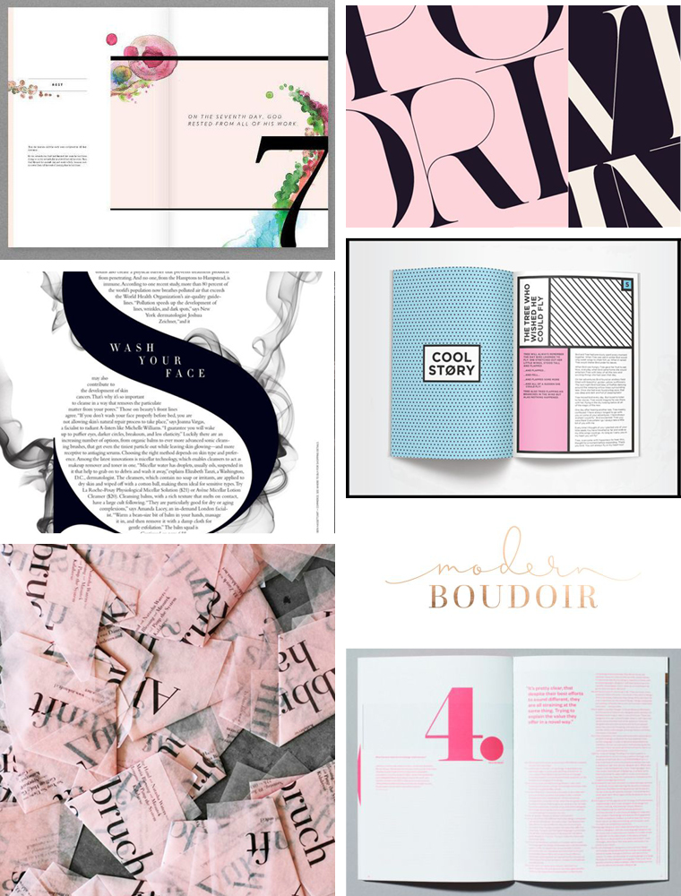
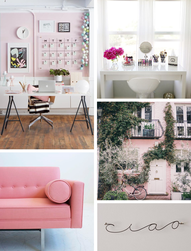
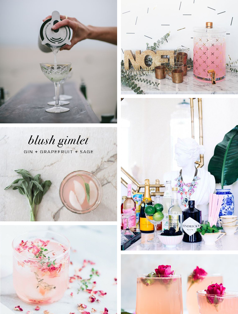
I've separated my inspiration categorically for the sake of this post – the moodboard above is typography. You'll find throughout my inspiration that a pale pink (not quite as pale as a blush pink, and not as bold as a bubblegum) and a sharp black are the main recurring colors of my scheme. Accents like lavender, gray, and metallics appear occasionally, but pink + black are my go tos.
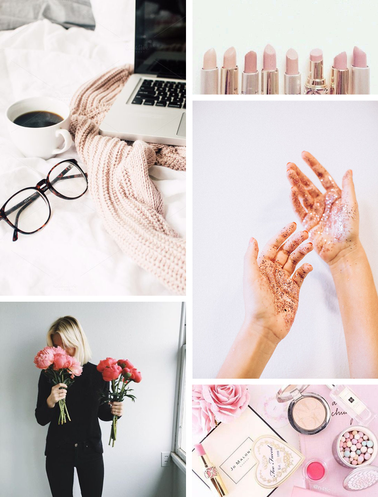
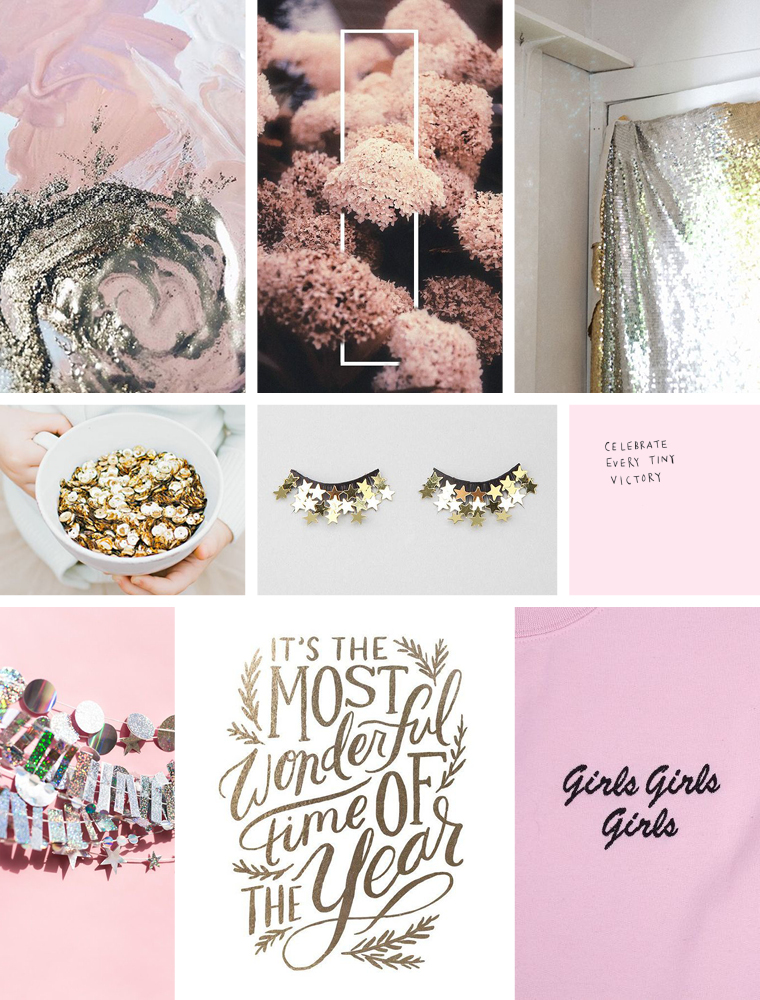
The main categories I've found myself honing in on are personal style, home decor, and entertaining, so I tried to tie those things in to my inspiration search as well. I get so excited just looking at these images; I can't wait to get the ball rolling this year.[/tatsu_text][/tatsu_column][/tatsu_row][tatsu_row layout= "1/2+1/2"][tatsu_column layout= "1/2"][tatsu_text max_width= "" wrap_alignment= "center" animation_type= "none"]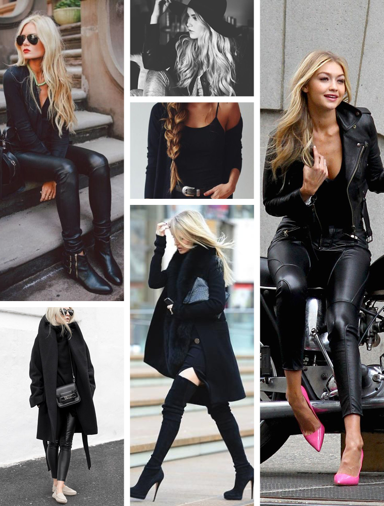
 [/tatsu_text][/tatsu_column][tatsu_column layout= "1/2"][tatsu_text max_width= "" wrap_alignment= "center" animation_type= "none"]
 [/tatsu_text][/tatsu_column][/tatsu_row][tatsu_row layout= "1/1"][tatsu_column layout= "1/1"][tatsu_text max_width= "" wrap_alignment= "center" animation_type= "none"]If you head over to fortheglitz.com now, you can sign up to get notified when we launch on the 16th! I can't wait to get this party started.
And of course in the meantime, you can always follow along on Instagram and Pinterest![/tatsu_text][/tatsu_column][/tatsu_row][/tatsu_section]
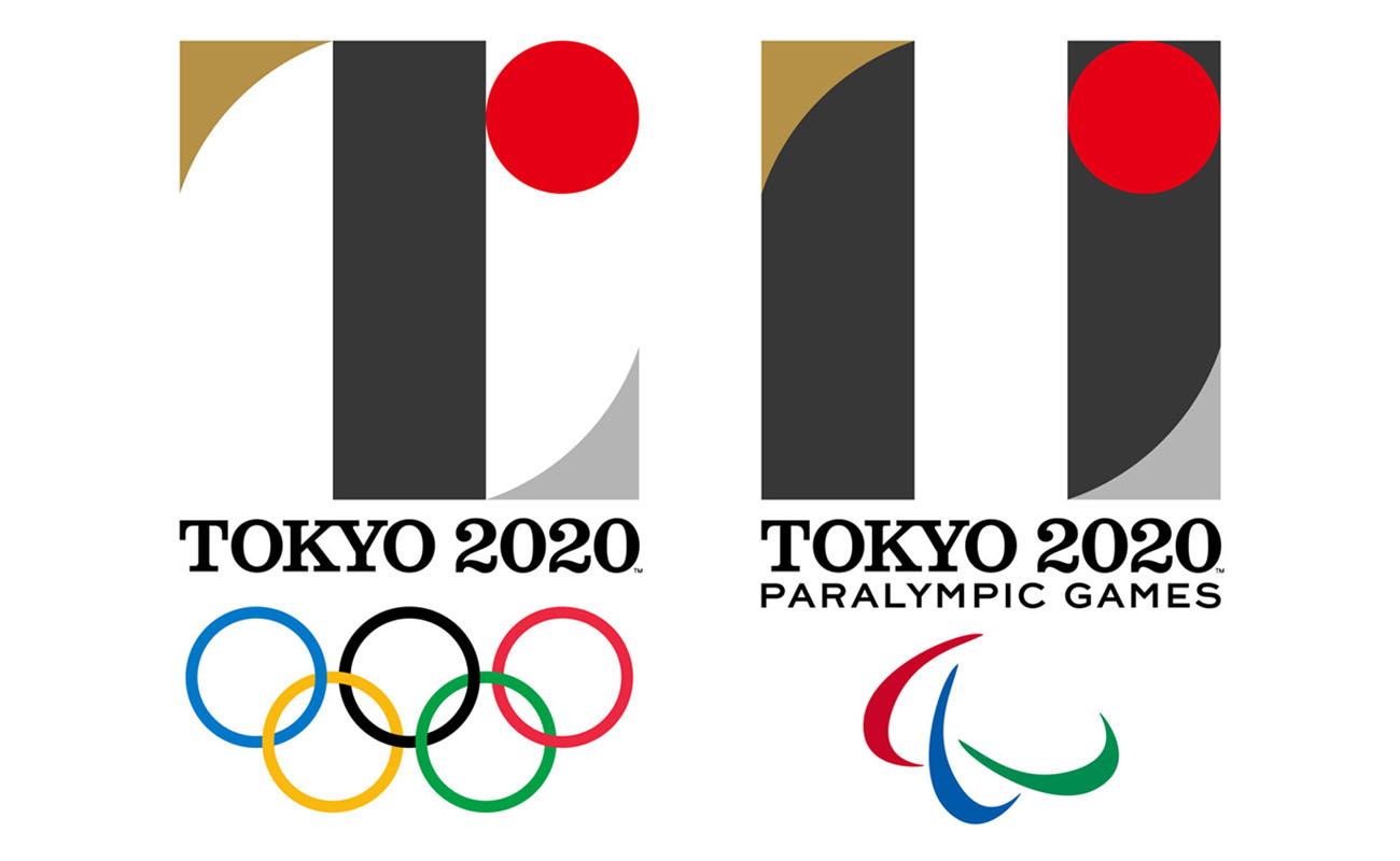
 [/tatsu_text][tatsu_text max_width= "" wrap_alignment= "center" animation_type= "none"]However, one point of contention lies with the idea brought forth by Olivier Debie that Sano plagiarized his work for Belgium’s Théâtre de Liège. The Tokyo 2020 Organizing Committee defended Sano’s work, explaining that prior to choosing the design, the group “conducted long, extensive, and international verifications through a transparent process.” While the two do share a striking resemblance, Debie’s mark is not registered or copyrighted, giving his claims to take legal action much less impact. With the rise of social media, everyone’s opinion is heard–whether they know anything about graphic design or not. This can be both helpful and harmful, as it’s become nearly impossible for any awaited design to meet a majority of positive reviews. However,
 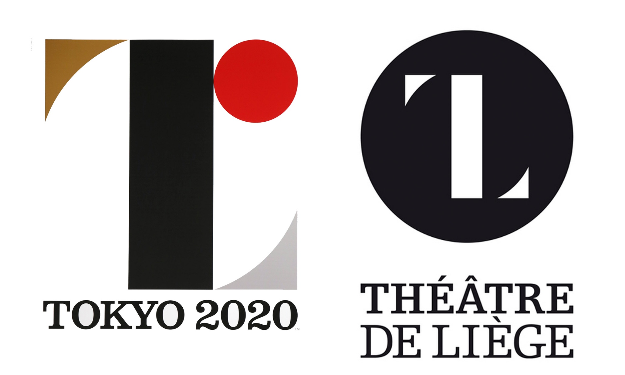 [/tatsu_text][tatsu_text max_width= "" wrap_alignment= "center" animation_type= "none"]I love the Olympics and I also love branding systems, so the task of forming the identity of the Olympic Games is one that has always interested me. My final semester in school, I completed an independent study project where I created an identity system that was adaptable to whichever city was chosen to host the Olympics in 2024. The system for
  [/tatsu_text][tatsu_text max_width= "" wrap_alignment= "center" animation_type= "none"]
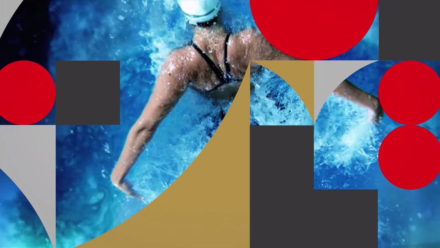 [/tatsu_text][tatsu_text max_width= "" wrap_alignment= "center" animation_type= "none"]
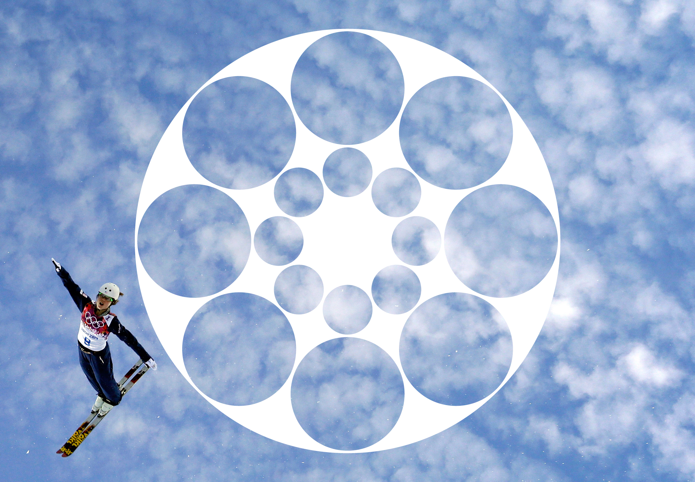 [/tatsu_text][tatsu_text max_width= "" wrap_alignment= "center" animation_type= "none"]
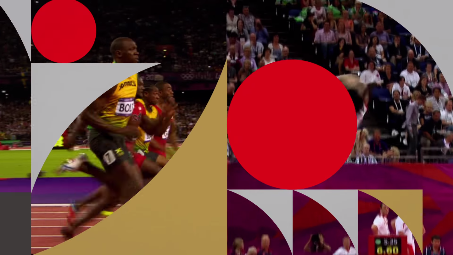 [/tatsu_text][tatsu_text max_width= "" wrap_alignment= "center" animation_type= "none"]I’m eager to see how the system is implemented across various mediums as we get closer to the Games and more materials are released.[/tatsu_text][/tatsu_column][/tatsu_row][/tatsu_section]