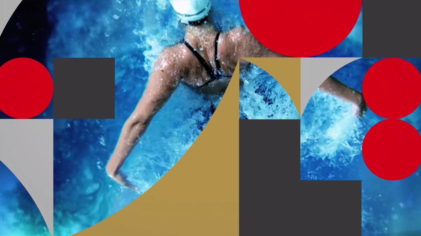
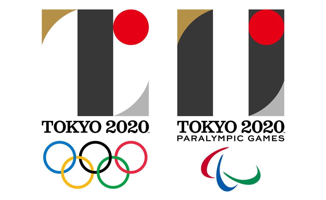
[tatsu_section padding= "90px 0% 90px 0%"][tatsu_row layout= "1/1"][tatsu_column layout= "1/1"][tatsu_text max_width= "" wrap_alignment= "center" animation_type= "none"]The logomark for the 2020 Tokyo Olympic and Paralympic Games was released at the end of July, marking exactly five years prior to the Opening Ceremonies. Designed by Kenjiro Sano (founder of Tokyo studio MR_DESIGN), the mark is geometric in form and stands representative as part of a larger system (as demonstrated in the video below). The T formed by the mark stands for “Tokyo,” “Tomorrow,” and “Team,” the apparent themes of these Games.[/tatsu_text][tatsu_video source= "youtube" url= "https://www.youtube.com/watch?v=v3s6fxIFTH0" animation_type= "none"][/tatsu_video][tatsu_text max_width= "" wrap_alignment= "center" animation_type= "none"]
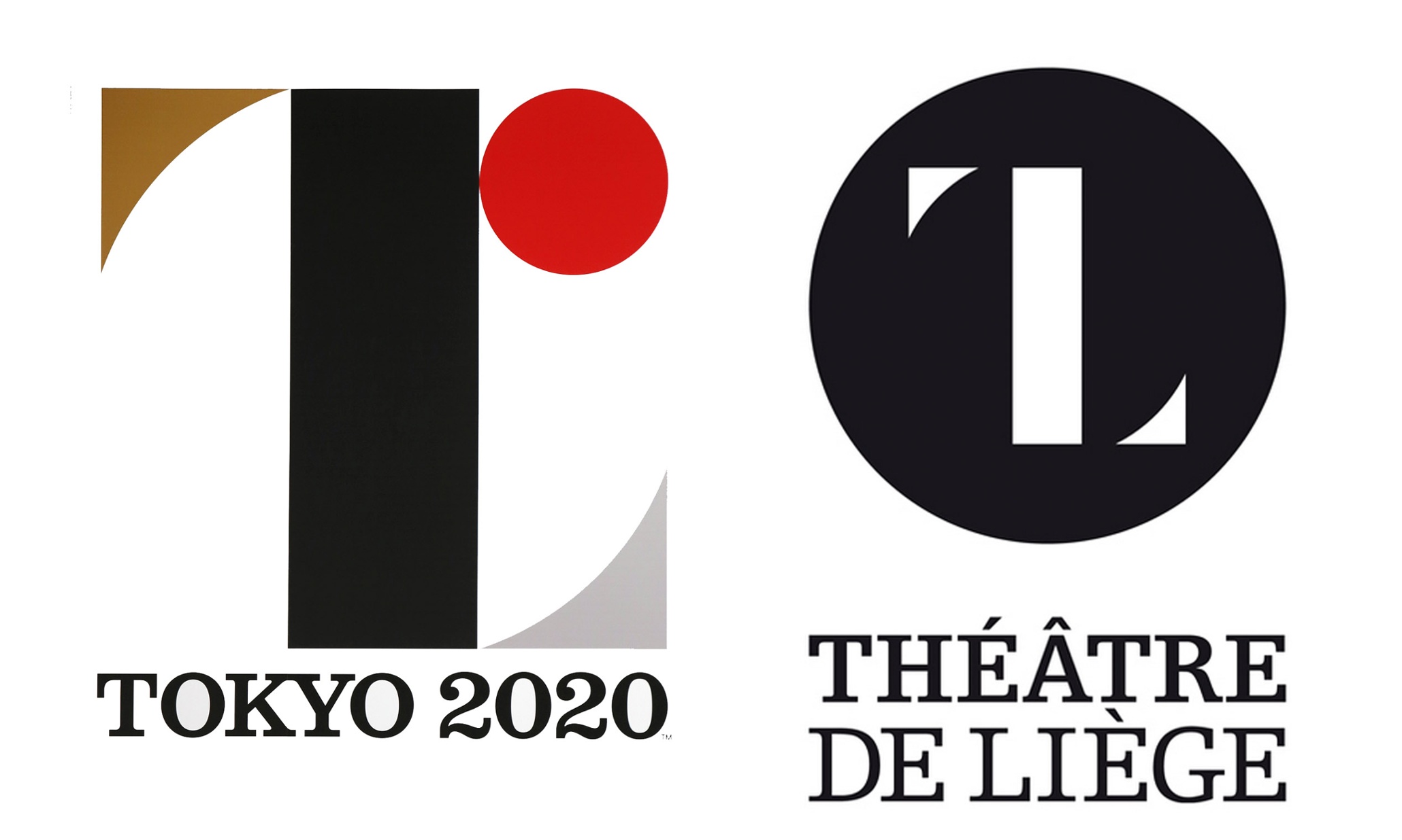
The logo has met mixed reviews across the internet, as any prominent piece of graphic design does—some say it is uninspired and confusing, while others praise its simplicity and cleanliness. I don’t mind the new logo—I actually like it. I think it’s clean and refreshing and a hell of a lot better than the logos we’ve seen for the past few Olympic Games by far.[/tatsu_text][tatsu_text max_width= "" wrap_alignment= "center" animation_type= "none"]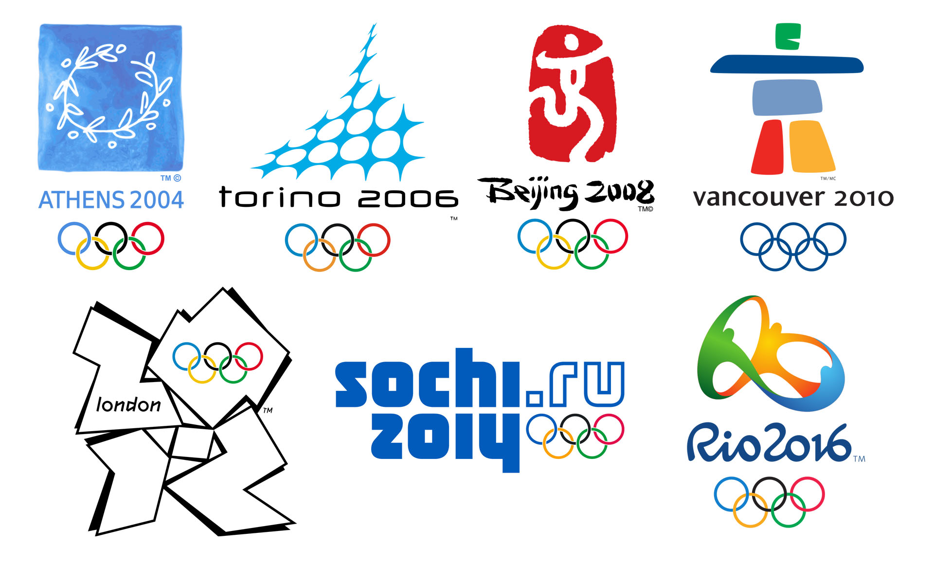 [/tatsu_text][tatsu_text max_width= "" wrap_alignment= "center" animation_type= "none"]However, one point of contention lies with the idea brought forth by Olivier Debie that Sano plagiarized his work for Belgium’s Théâtre de Liège. The Tokyo 2020 Organizing Committee defended Sano’s work, explaining that prior to choosing the design, the group “conducted long, extensive, and international verifications through a transparent process.” While the two do share a striking resemblance, Debie’s mark is not registered or copyrighted, giving his claims to take legal action much less impact. With the rise of social media, everyone’s opinion is heard–whether they know anything about graphic design or not. This can be both helpful and harmful, as it’s become nearly impossible for any awaited design to meet a majority of positive reviews. However, this isn’t the first time an Olympic logo has run into trouble, and it probably won't be the last.[/tatsu_text][tatsu_text max_width= "" wrap_alignment= "center" animation_type= "none"]
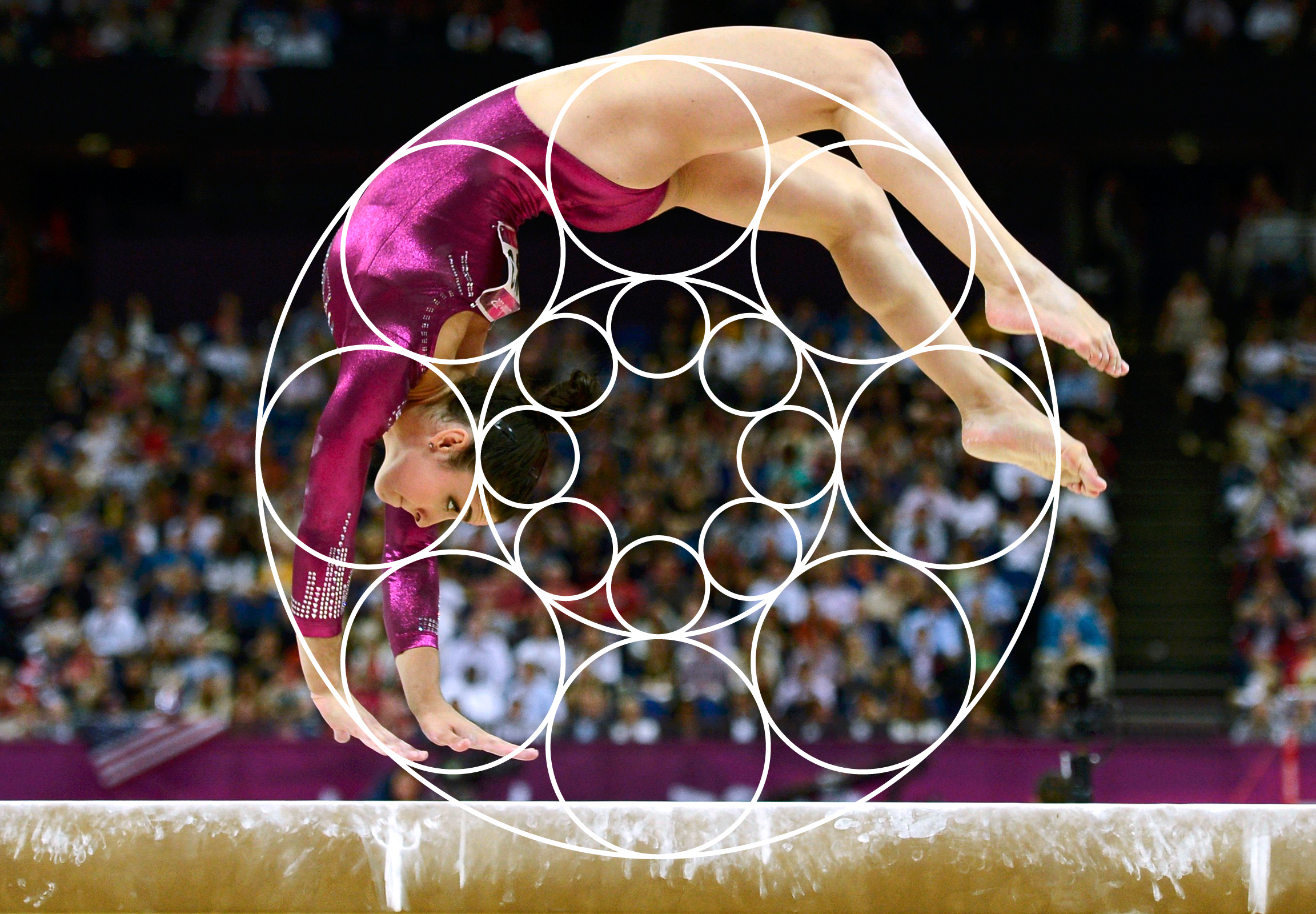
 [/tatsu_text][tatsu_text max_width= "" wrap_alignment= "center" animation_type= "none"]I love the Olympics and I also love branding systems, so the task of forming the identity of the Olympic Games is one that has always interested me. My final semester in school, I completed an independent study project where I created an identity system that was adaptable to whichever city was chosen to host the Olympics in 2024. The system for Host City 2024 is loosely based on the interactions between the Olympic rings, inspired by an old poster for the 1932 LA Olympics. The identity changes and shifts as it is applied over various imagery for the Games, in a way very similar to the Tokyo 2020 system.[/tatsu_text][tatsu_text max_width= "" wrap_alignment= "center" animation_type= "none"]
 [/tatsu_text][tatsu_text max_width= "" wrap_alignment= "center" animation_type= "none"]
 [/tatsu_text][tatsu_text max_width= "" wrap_alignment= "center" animation_type= "none"]
 [/tatsu_text][tatsu_text max_width= "" wrap_alignment= "center" animation_type= "none"]
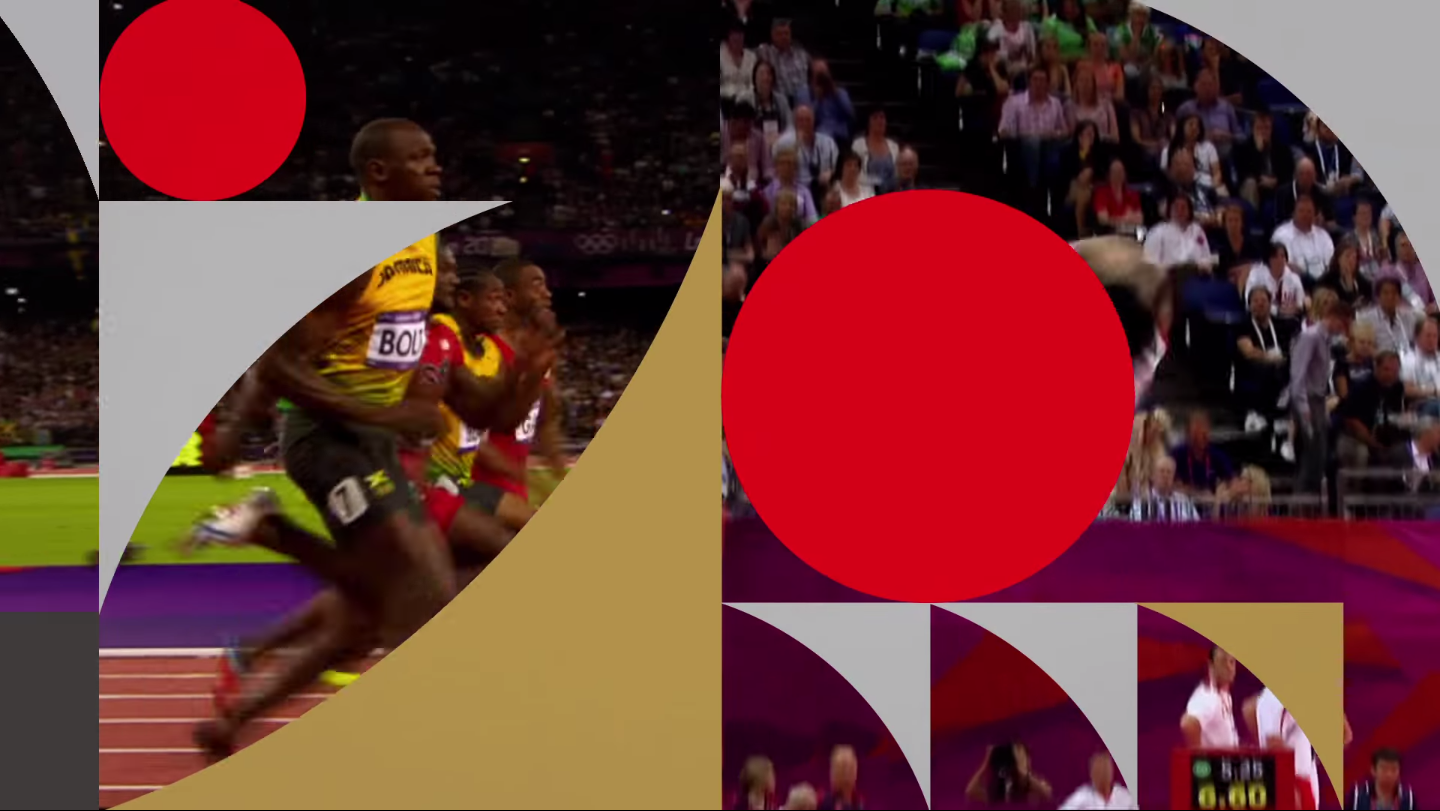 [/tatsu_text][tatsu_text max_width= "" wrap_alignment= "center" animation_type= "none"]I’m eager to see how the system is implemented across various mediums as we get closer to the Games and more materials are released.[/tatsu_text][/tatsu_column][/tatsu_row][/tatsu_section]

No comments.