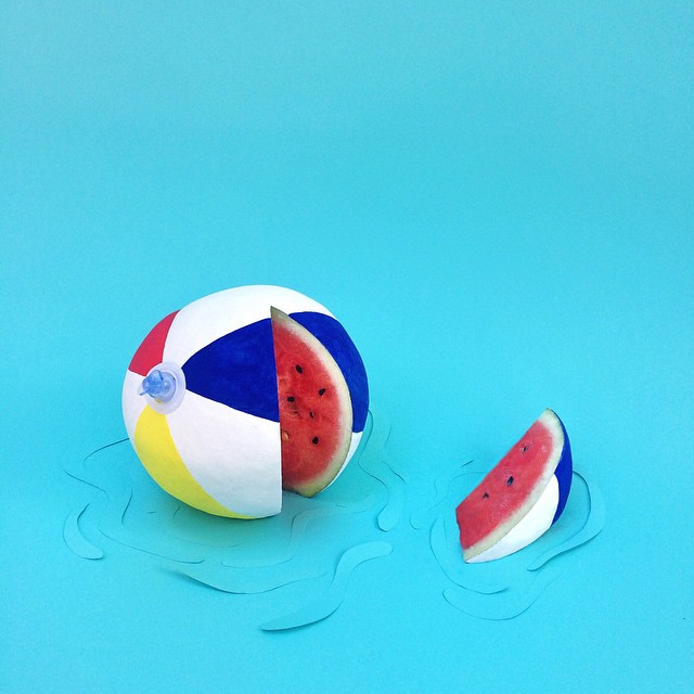
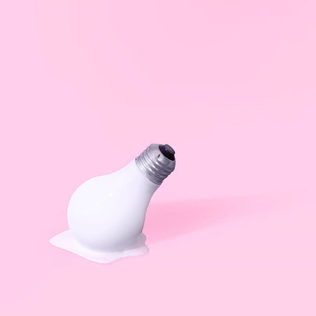
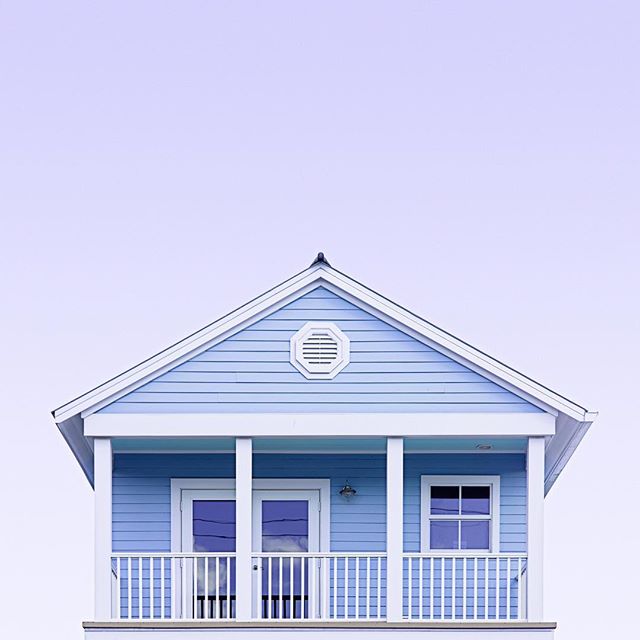
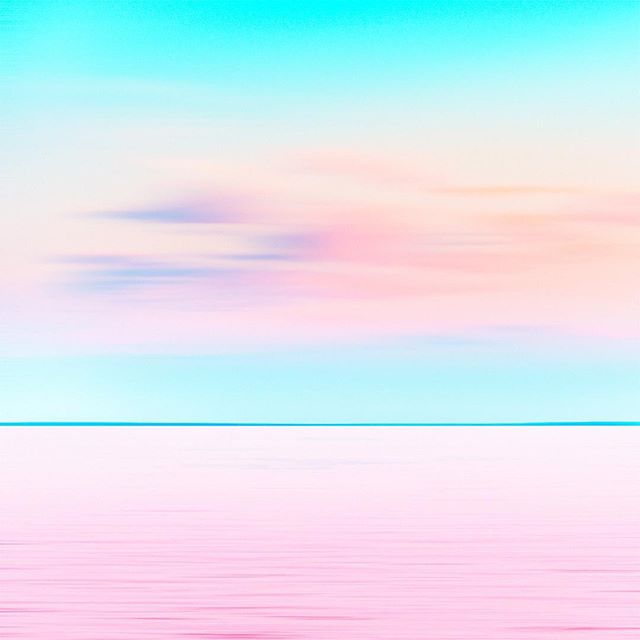
[tatsu_section padding= "90px 0% 90px 0%"][tatsu_row layout= "1/1"][tatsu_column layout= "1/1"][tatsu_text max_width= "" wrap_alignment= "center" animation_type= "none"]This post is the beginning of a new series I'd like to start writing about design trends and movements. Candy minimalism has exploded in the art and design world since Matt Crump began posting his sweet creations on Instagram. He has since created a features account, @candyminimal, where he reposts the standouts of the hundreds of #candyminimal style photos published daily.[/tatsu_text][tatsu_text max_width= "" wrap_alignment= "center" animation_type= "none"]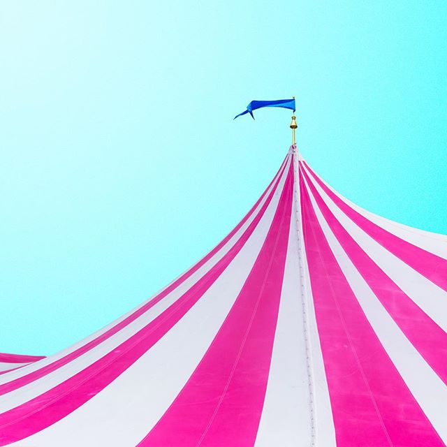 [/tatsu_text][tatsu_text max_width= "" wrap_alignment= "center" animation_type= "none"]Obviously, key elements of this trend are the colors and saturation as well as minimalism (hence the name). To achieve this kind of look in your own photos, try out these tips:
- Look up. Cropping out the busy streets or the façades of boring buildings give you more negative sky space and room to play with color.
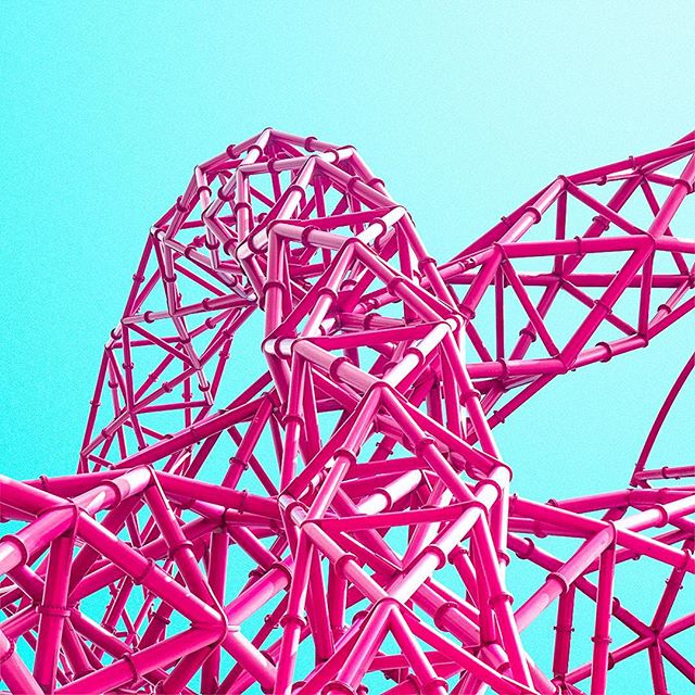
- Play with the composition. Really consider the shapes formed by the negative spaces and what's left in the image to create a truly compelling snapshot.
- Choose your colors carefully. Evaluate the subject matter of your photo and think about the colors that would compliment the content well.
- Details matter. While the focus is minimalist, interesting textures found in architectural structures or plants can add depth to your compositions.
- Edit your photos! There are tons of apps that are helpful in editing your own #candyminimal photos. Check out Diptic, PicTapGo, AfterLight, VSCOcam, Touch Retouch, ArtStudio, Tangent, Mextures, and of course, Instagram.
[/tatsu_text][tatsu_text max_width= "" wrap_alignment= "center" animation_type= "none"]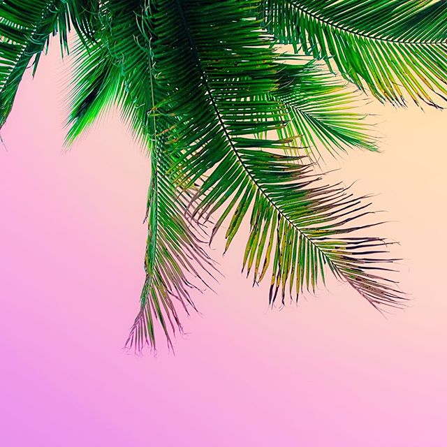 [/tatsu_text][tatsu_text max_width= "" wrap_alignment= "center" animation_type= "none"]
 [/tatsu_text][tatsu_text max_width= "" wrap_alignment= "center" animation_type= "none"]Apart from Matt Crump, there are dozens of other successful candy minimalists out there. Check out some of my favorites below.[/tatsu_text][/tatsu_column][/tatsu_row][tatsu_row layout= "1/1"][tatsu_column layout= "1/1"][tatsu_text max_width= "" wrap_alignment= "center" animation_type= "none"]
@téber
[/tatsu_text][/tatsu_column][/tatsu_row][tatsu_row layout= "1/2+1/2"][tatsu_column layout= "1/2"][tatsu_text max_width= "" wrap_alignment= "center" animation_type= "none"]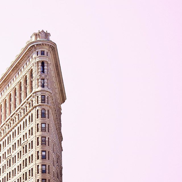 [/tatsu_text][tatsu_text max_width= "" wrap_alignment= "center" animation_type= "none"]
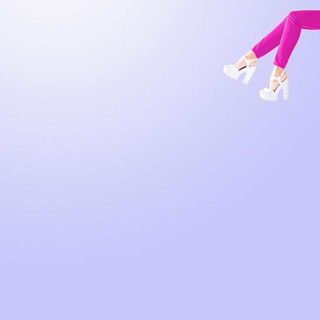 [/tatsu_text][/tatsu_column][tatsu_column layout= "1/2"][tatsu_text max_width= "" wrap_alignment= "center" animation_type= "none"]
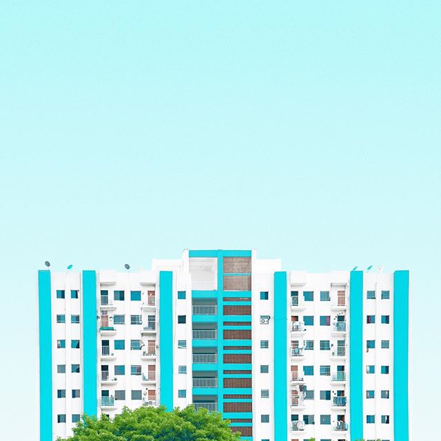 [/tatsu_text][tatsu_text max_width= "" wrap_alignment= "center" animation_type= "none"]
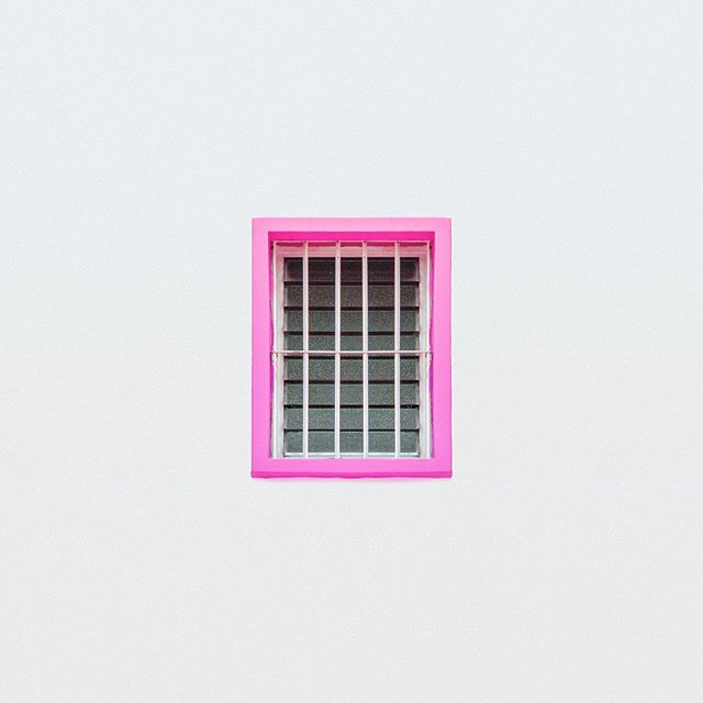 [/tatsu_text][/tatsu_column][/tatsu_row][tatsu_row layout= "1/1"][tatsu_column layout= "1/1"][tatsu_text max_width= "" wrap_alignment= "center" animation_type= "none"]
@runnerkimhall
[/tatsu_text][/tatsu_column][/tatsu_row][tatsu_row layout= "1/2+1/2"][tatsu_column layout= "1/2"][tatsu_text max_width= "" wrap_alignment= "center" animation_type= "none"]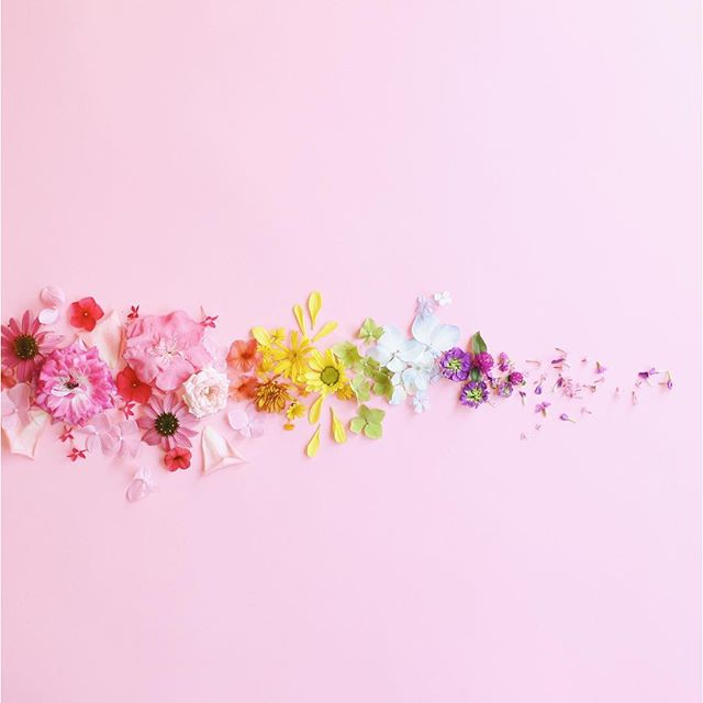 [/tatsu_text][tatsu_text max_width= "" wrap_alignment= "center" animation_type= "none"]
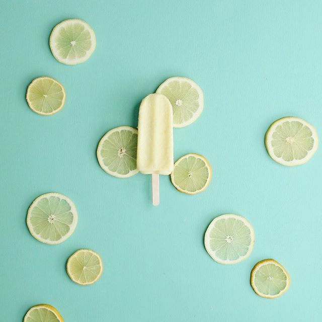 [/tatsu_text][/tatsu_column][tatsu_column layout= "1/2"][tatsu_text max_width= "" wrap_alignment= "center" animation_type= "none"]
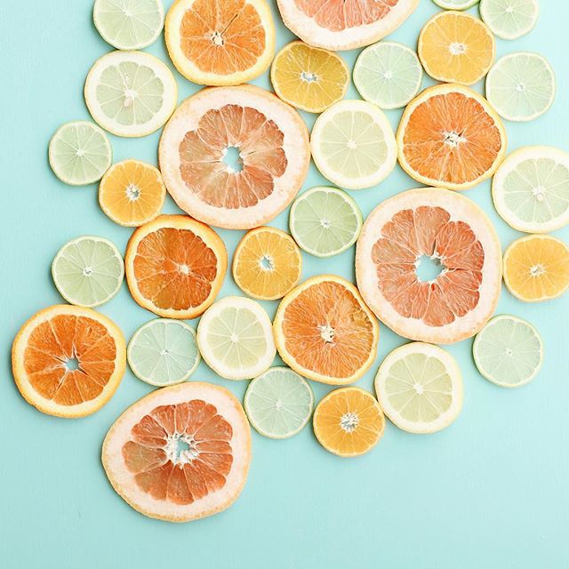 [/tatsu_text][tatsu_text max_width= "" wrap_alignment= "center" animation_type= "none"]
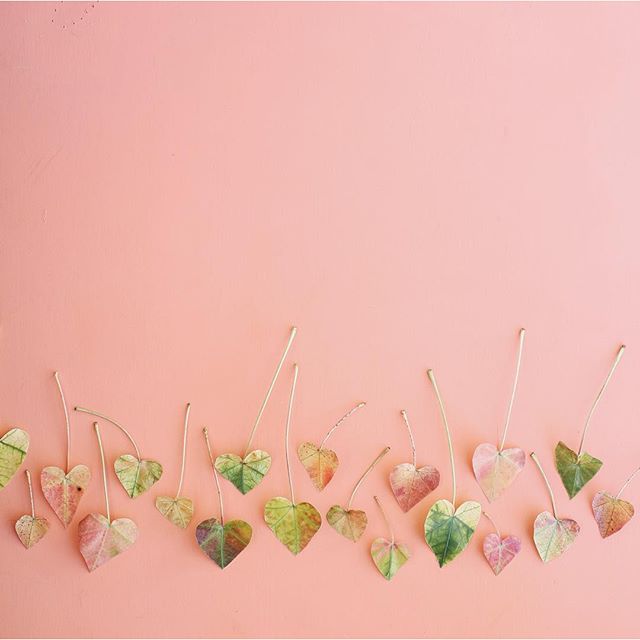 [/tatsu_text][/tatsu_column][/tatsu_row][tatsu_row layout= "1/1"][tatsu_column layout= "1/1"][tatsu_text max_width= "" wrap_alignment= "center" animation_type= "none"]
@littledrill
[/tatsu_text][special_sub_title title_content= "@littledrill" font_size= "18" title_color= "#f43fac" title_alignment= "center" max_width= "100" margin_bottom= "0" animation_type= "none"][/special_sub_title][/tatsu_column][/tatsu_row][tatsu_row layout= "1/2+1/2"][tatsu_column layout= "1/2"][tatsu_text max_width= "" wrap_alignment= "center" animation_type= "none"] [/tatsu_text][tatsu_text max_width= "" wrap_alignment= "center" animation_type= "none"]
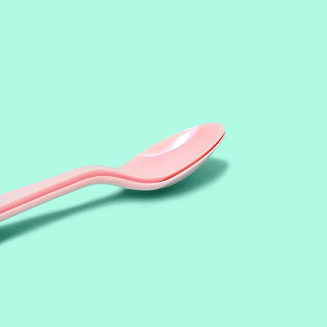 [/tatsu_text][/tatsu_column][tatsu_column layout= "1/2"][tatsu_text max_width= "" wrap_alignment= "center" animation_type= "none"]
 [/tatsu_text][tatsu_text max_width= "" wrap_alignment= "center" animation_type= "none"]
 [/tatsu_text][/tatsu_column][/tatsu_row][tatsu_row layout= "1/1"][tatsu_column layout= "1/1"][tatsu_text max_width= "" wrap_alignment= "center" animation_type= "none"]Gotta love all the eye candy! Let me know if you use any of the tips or apps mentioned above to make your own #candyminimal creations on Instagram.[/tatsu_text][tatsu_text max_width= "" wrap_alignment= "center" animation_type= "none"]
 [/tatsu_text][/tatsu_column][/tatsu_row][/tatsu_section]
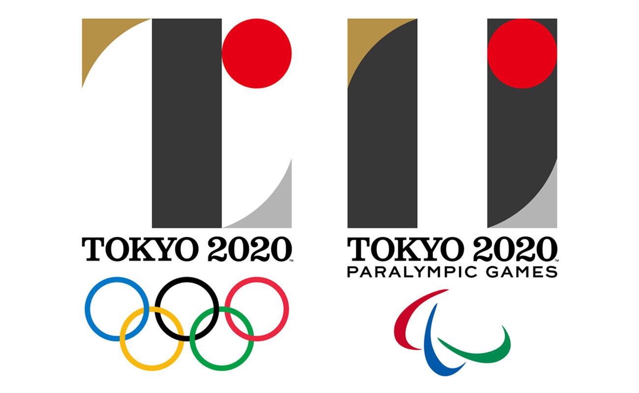
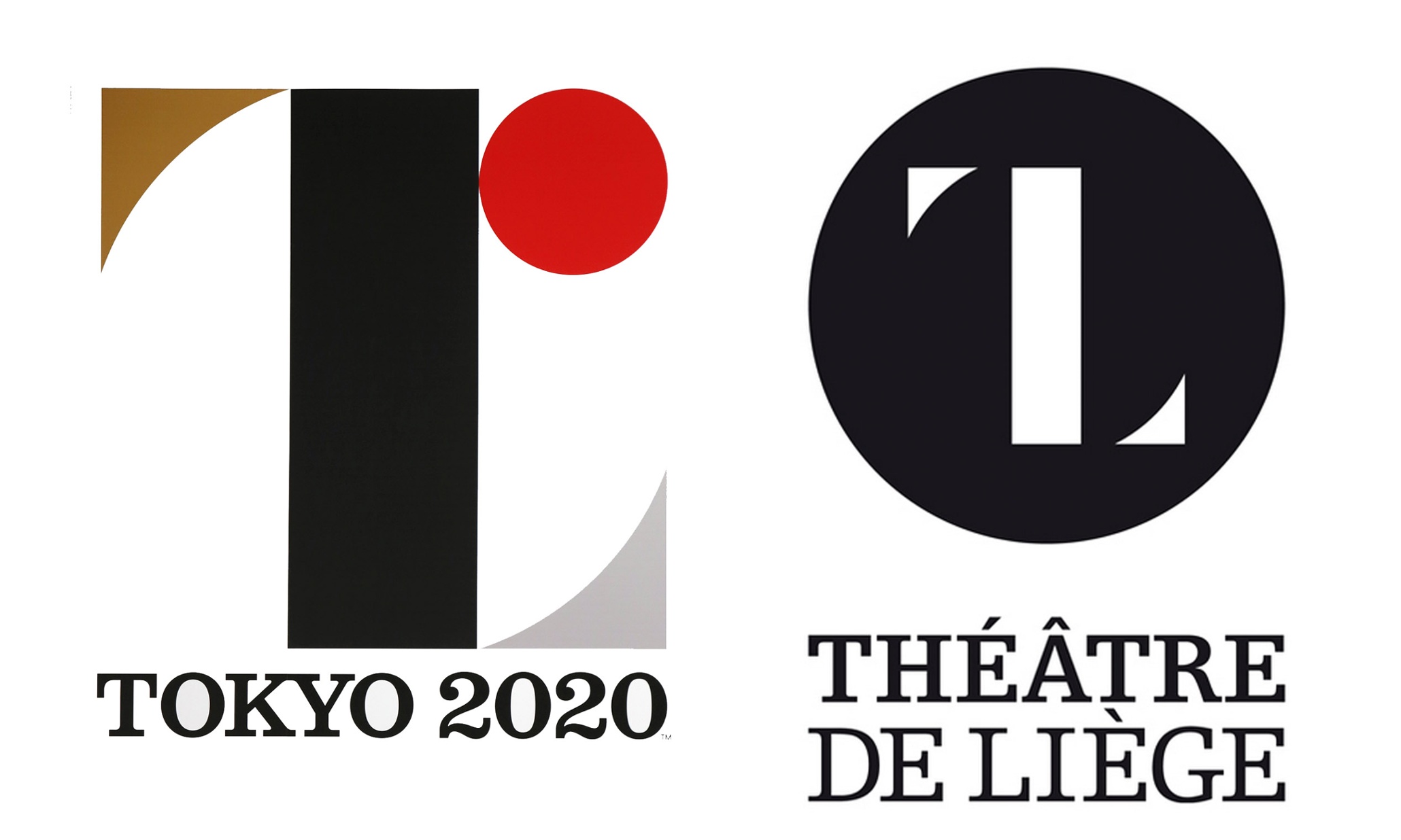
 [/tatsu_text][tatsu_text max_width= "" wrap_alignment= "center" animation_type= "none"]However, one point of contention lies with the idea brought forth by Olivier Debie that Sano plagiarized his work for Belgium’s Théâtre de Liège. The Tokyo 2020 Organizing Committee defended Sano’s work, explaining that prior to choosing the design, the group “conducted long, extensive, and international verifications through a transparent process.” While the two do share a striking resemblance, Debie’s mark is not registered or copyrighted, giving his claims to take legal action much less impact. With the rise of social media, everyone’s opinion is heard–whether they know anything about graphic design or not. This can be both helpful and harmful, as it’s become nearly impossible for any awaited design to meet a majority of positive reviews. However,
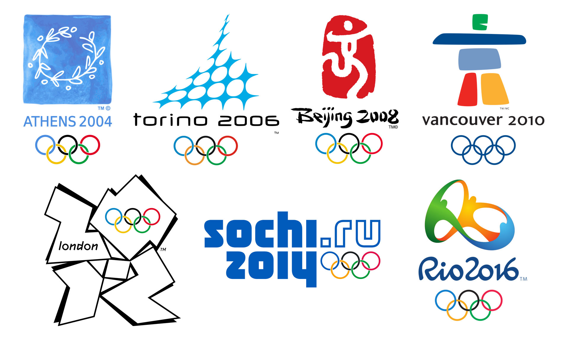
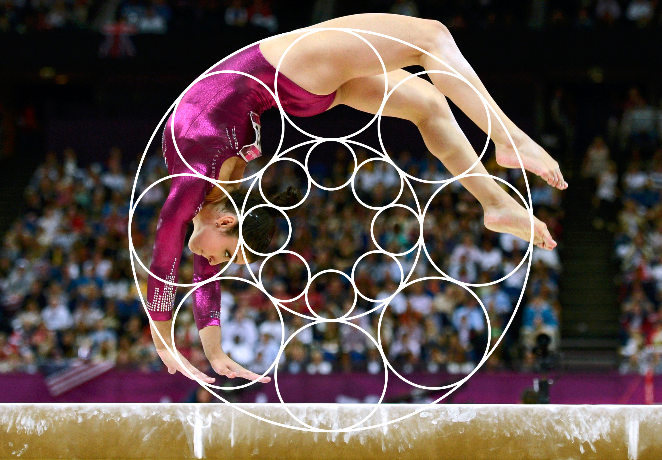
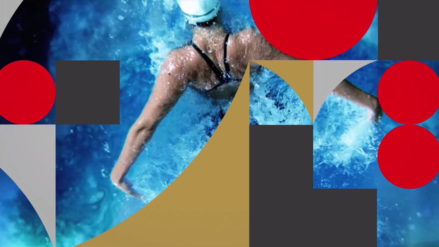
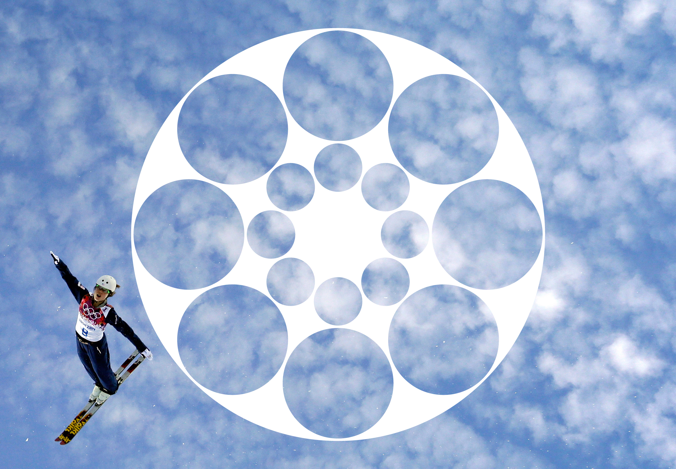
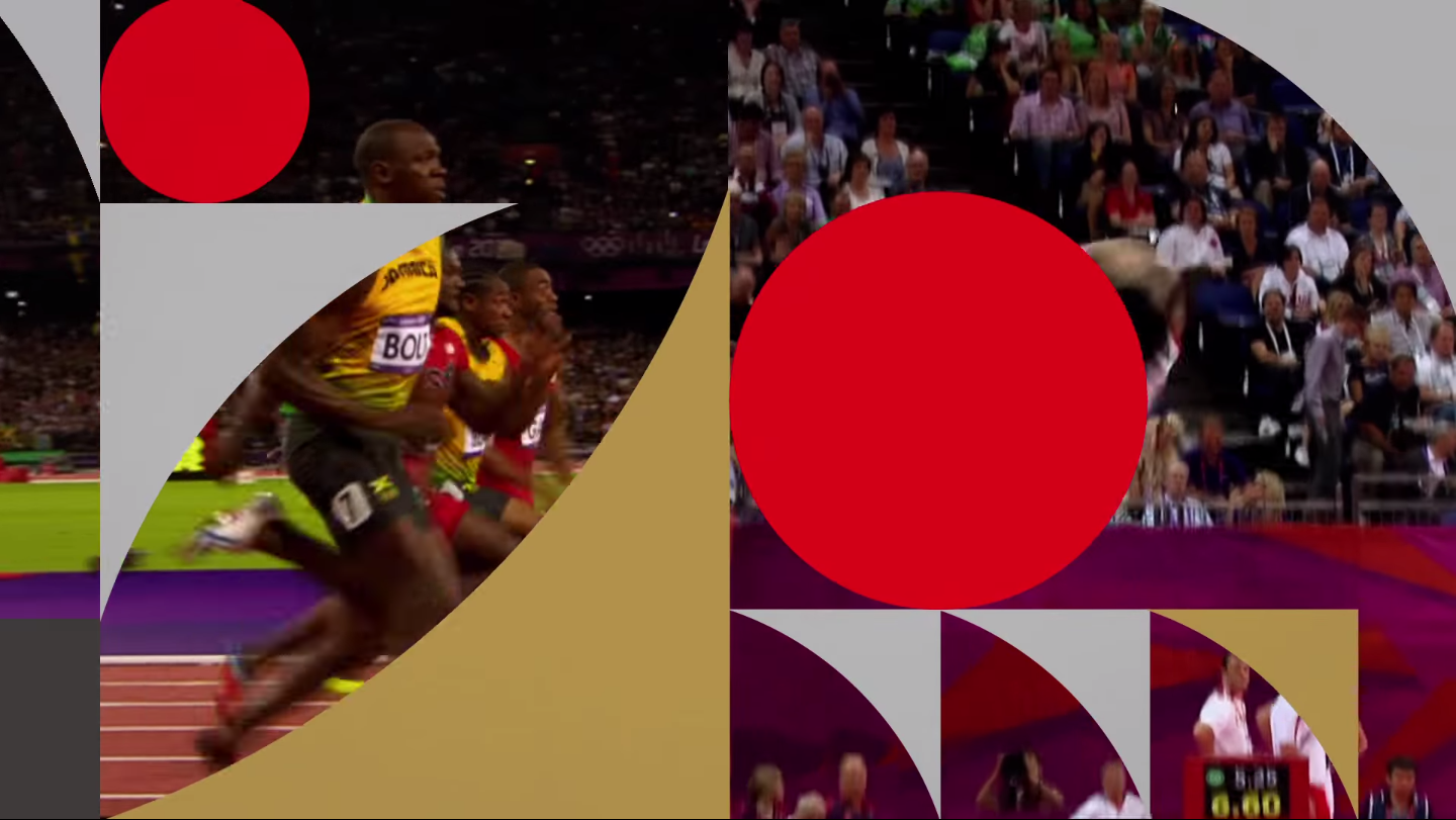
  [/tatsu_text][tatsu_text max_width= "" wrap_alignment= "center" animation_type= "none"]I love the Olympics and I also love branding systems, so the task of forming the identity of the Olympic Games is one that has always interested me. My final semester in school, I completed an independent study project where I created an identity system that was adaptable to whichever city was chosen to host the Olympics in 2024. The system for
  [/tatsu_text][tatsu_text max_width= "" wrap_alignment= "center" animation_type= "none"]
 [/tatsu_text][tatsu_text max_width= "" wrap_alignment= "center" animation_type= "none"]
 [/tatsu_text][tatsu_text max_width= "" wrap_alignment= "center" animation_type= "none"]
 [/tatsu_text][tatsu_text max_width= "" wrap_alignment= "center" animation_type= "none"]I’m eager to see how the system is implemented across various mediums as we get closer to the Games and more materials are released.[/tatsu_text][/tatsu_column][/tatsu_row][/tatsu_section]